Create CTAs That People Click
Today's case study is all about buttons.
Trust me, it's more important than you imagine.
And can make an impact on your conversion rate.
Let's run through these 6 tips:
1. Soft CTAs vs Hard CTAs
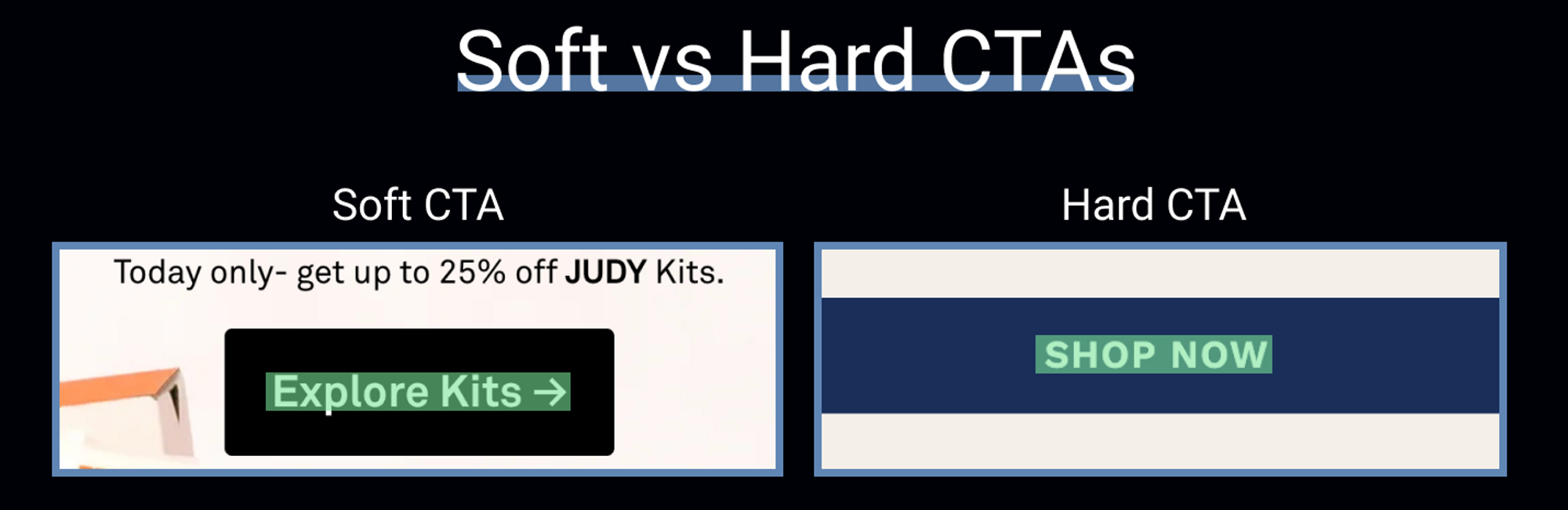
It’s important to ensure your CTA matches the customer's buying journey.
If this is the first time someone is interacting with your brand (Homepage, Advertorial, Listicle, etc.), “buy now” is too upfront and commanding.
It’s like skipping the date and straight up asking someone to be your significant other.
So, if your potential buyer just found out about your product, a “learn more” is much more appropriate and makes them feel like the decision is up to them as opposed to a “buy now”.
Quick Examples:
Hard CTAs:
Buy Now, Purchase, Claim Offer, Add To Cart, Make Selection, Get Yours, Secure Spot, Download, Subscribe, Proceed to Cart, Checkout Now, Get Mine Now, etc….
Soft CTAs:
Learn More, Explore, Compare Items, Browse Collection, Discover, Show More, See Features, View Products, etc…
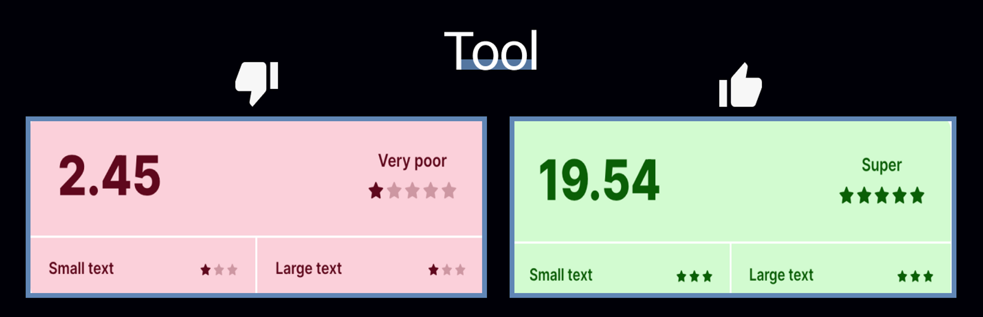
2. Colors & Readability

If you want people to click your buttons, they must see them.
Use colors that stand out from your background.
On the left, the button blends into the background, has a thin font, and is greyish, making it stand out even less.
But on the right, the contrast makes it stand out; the thick font is easily readable, and the white contrasts perfectly with the purple background.
Bonus: Use this free tool to check your contrast → https://coolors.co/contrast-checker/
3. Sticky Buttons
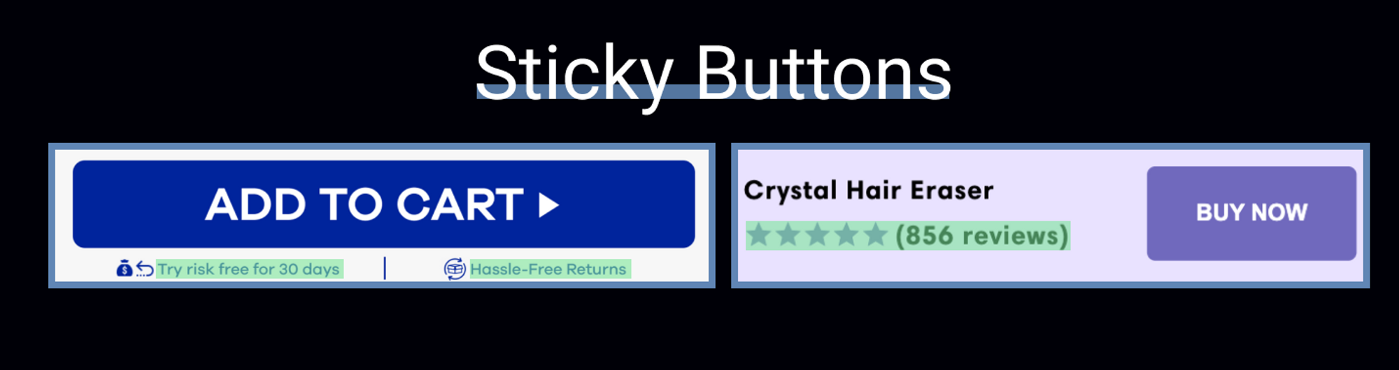
Should you use sticky buttons on your landing page?
Anyone with a lot of experience will tell you they can hurt your conversion rate if not done correctly.
So here are some things to consider.
Avoid Banner Blindness
Make sure your sticky add-to-cart stands out from the rest of your page.
Make sure it's supplementary to your actual add-to-cart button ATF and pops up after a % scrolled.
Space = Opportunity
White space presents another opportunity to remove friction and convert a visitor into a buyer.
Here are some things that you can try adding to your sticky add-to-cart button:
- Risk Reversal (Guarantees)
- Shipping Benefits (Easy Returns, Free Shipping, Quick Shipping, etc.)
- Social Proof (# of customers, # of items sold, # of 5* ratings, # of reviews, # of portions sold, testimonials, certifications (e.g. #1 voted product of 2022) etc…)
4. Remove Unnecessary Friction
If your add-to-cart is anchored to your ATF or any other section without good reason (selling bundles, different versions of a product, etc.), you are adding unnecessary friction to the buying process.
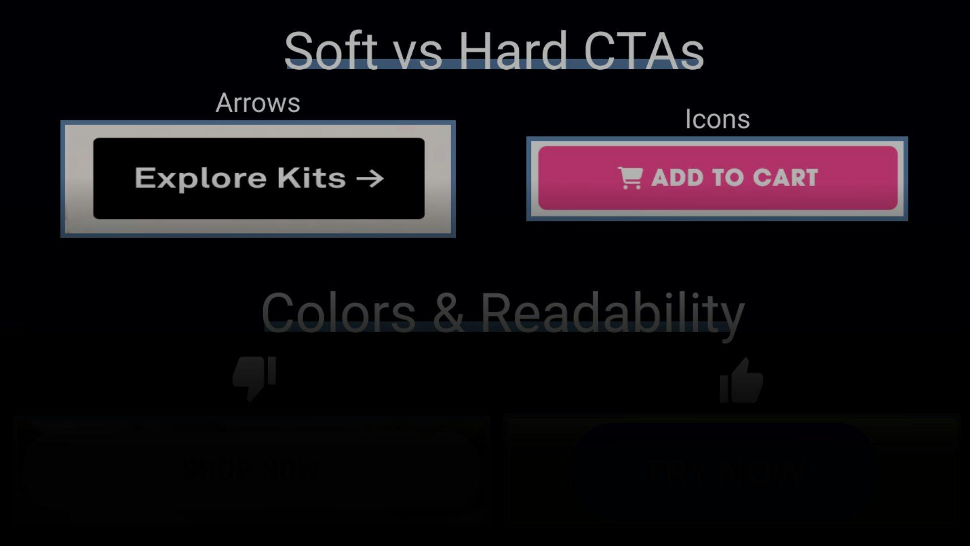
Should You Use Icons?
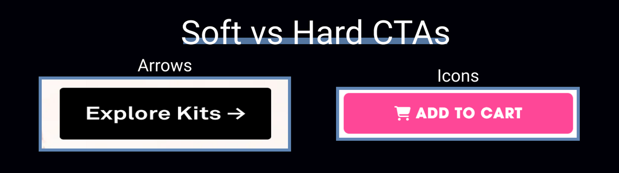
Yes, as long as they make sense, but it should be A/B tested (as most things should be) since I’ve seen it increase, but also sometimes lower conversion rates.
Shopping Cart = add to cart, Lock = safe, etc.
Arrow = continue/take you to the next step.